Saturday, December 31, 2011

the good stuff from 2011


With all of the travel and adventure that I experienced in 2010, it was one of the best years of my life and will be pretty much impossible to top.  Despite a severe lack of travel, 2011 has been really good in a different way.  The stability of staying in one place has made it possible to have a proper studio again, with access to my art supplies and papers, computer, printer, scanner, drawing table, good lighting... all things I went without while we were traveling.  I found ways to get around needing those things, but it's been nice to have everything at my fingertips again.

The beginning of 2011 saw us move to the city of Calgary, Alberta, into a fun, trendy, and central neighborhood.  We settled into an apartment with a studio space and enjoyed staying in one place for a while.  It was nice to reconnect with family and old friends.  But we also made many new friends this year.

I did illustration work for a bunch of new clients.  I got a part time job to get me out of the studio and to take some of the pressure off of illustrating.  And I learned a ton about spices thanks to The Silk Road Spice Merchant.  My favorite dish that I learned to make this year was Louisiana Shrimp Gumbo. Yum.

The biggest joy 2011 brought was definitely being commissioned by Fitzhenry & Whiteside to illustrate the picture book Bye, Bye, Butterflies.  It's been a goal of mine to do that since I graduated from the Alberta College of Art and Design in 2002.  It took 9 years, but I did it!

Happy New Year everyone!

Sunday, December 18, 2011

the 'caterpillar' spread

Things have been a little quiet on the blog as of late, but believe me when I say they've been quite busy in the studio.  The picture book that I'm illustrating, Bye, Bye, Butterflies, is coming along nicely.  I'm currently painting spreads and I look forward to sharing some of the finished, full color images down the road.

For now, I'm going to share another sketch. 

I really struggled to find a solution for this particular spread.  I didn't want to be literal and draw exactly what the text said so it was quite a challenge to come up with something that was a bit abstract but still appropriate.  Probably because it was such a struggle, when I finally came up with my solution I was especially happy with the image.

Here it is:


It might not look like much here, but try to imagine a bunch of colorful and interesting caterpillars marching across the page in this lovely shape. 

Unfortunately, this is the only place where it will see the light of day.  Once I submitted my sketches to my editor, we realized that we needed to shuffle some things around and the only way to make it work was to combine this spread with another one.  It broke my heart to have to change it as I really enjoyed the graphic shape moving across the page, but it was all for the greater good.  The spread at the climax of the story now works much better because of this change. 

This is what the new spread will look like:


Tuesday, November 29, 2011

alberta by numbers

Today the postman brought me the December issue of AlbertaViews Magazine with my work illustrating the Alberta by Numbers section on the back page.  It was a fun little assignment to do and the art director was great to work with.

Also today, after almost exactly 5 years, my blog has reached 100 followers. 
Thanks for being interested in my work everyone.  It means a lot to me :)


Saturday, November 26, 2011

illustration friday - round

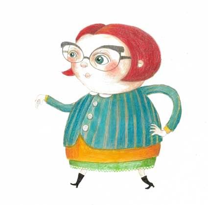
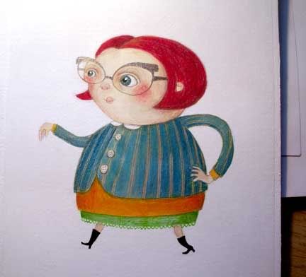
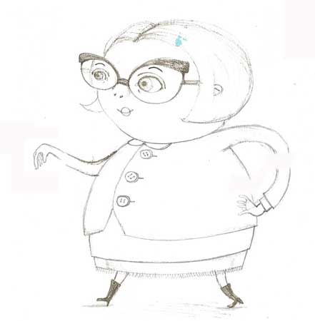
Because of the all the work involved with the picture book, I really don't have time to create anything new for IF right now.  But when I saw this week's topic, I immediately thought of this image of a very round lady that I painted last summer.

Wednesday, November 23, 2011

little girl in a red dress

This past weekend I finished an illustration for the picture book that I'm working on and I'm quite happy with how it turned out.  I'm not going to share the entire image right now, but here's a little peek at the bottom right corner:


Saturday, November 19, 2011

illustration friday - vanity


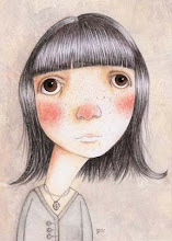
This image is an oldie but it's one of my favorites. It's more about the lack of vanity, but I think it's still appropriate for the theme.

Monday, November 7, 2011

the 'story time' spread

Today I thought I'd share some sketches from the picture book that I'm working on and show how the spread has evolved.

Let me begin by setting the scene.  The first part of this story takes place in the spring and the second part takes place one year later.  Between those two parts, there is one spread that ties them together and that is the spread that I'm going to share today.

The text talks about the main character, Charlie, starting school, attending story time, going to gym class, and then the passing of the seasons.  I really liked the idea of showing story time.  I thought it would make a nice image to have the teacher in a classroom setting with books and a globe, reading to a bunch of students sitting on the floor around her.

Here's my first thumbnail:

The problem with this image is that it doesn't convey the passing of time.  When a person reading the book turns that page, it has to feel like a year has passed and the above image doesn't convey that.

Showing some smaller spot illustrations helps to show the passing of time.  Since we go from fall, to winter, to spring, I decided to show one scene for each season.

I moved my story time sketch over to the left side of the spread and changed it to include a window so that a tree with fall leaves could be seen. On the right side of the spread, I drew two small spot illustrations.  After trying out many options, I decided to have Charlie and his friend making a snowman for the winter scene and Charlie jumping in a puddle for the spring scene.  I like the variety of showing Charlie interacting with another character and also showing him by himself.

My next thumbnail:


The proper sketches:

 (I thought it would be fun to have the pages that the teacher is reading be from an upcoming spread as a bit of foreshadowing :)


 This is what the spread looks like:


Or it might look like this:


I'm still experimenting to see which layout works better with the text.

Monday, October 31, 2011

storyboards for Bye, Bye, Butterflies!


I thought it might be interesting to show how much thought and work go into the early planning for the visuals for a book.  Everyone works a bit differently, but this was my approach.

Once I had read the manuscript for Bye, Bye, Butterflies!, I started by making a lot of notes about the things in the story that stood out to me and the initial images that came to my mind.  Then I doodled very rough layouts in small boxes to see what might work.  I did a lot of those.  Once I had an idea of which layouts seemed to work, I did slightly more refined drawings (but still quite rough) in little boxes that were scaled down from the actual size of the book.  That way I could see all of the spreads for the book on one piece of paper and I could see how they would work together.

My storyboard went through several incarnations as I tried to work out the pacing and figure out the best visuals to tell the story.  Once I was happy with it, I showed it to my editor who gave me very helpful feedback.  Then I used the storyboard to create the proper sketches for the book.

Stay tuned for a peek at some of those...

Saturday, October 22, 2011

just a peek

Last weekend I completed two illustration projects that I've had on the go.  Although I'm not showing them in their entirety until they're printed, here's a tiny peek...


Thursday, October 13, 2011

charlie's teacher

As promised, here's some more process from the picture book.  This is some of the character development for Charlie's teacher.


From the start I envisioned her with hair that would take on a big, interesting shape.  At first I was thinking she'd be a red head, but I didn't want her to steal the show from another red haired character in the story.


I played with some other options.  I thought pig tails might be fun.


But in the end, the big shape stayed and I've decided to render her hair with graphite.  I think it will make for a nice contrast with the paint I'll be using in the finals.  (This last drawing of her is from one of the spreads from the book)


Tuesday, October 11, 2011

another exciting finalist...

I was finally able to check the site to find out who the other Governor General award nominees were for children's illustration.  Red Wagon, written and illustrated by Renata Liwska is also nominated! Renata's books are so beautiful and Red Wagon is especially creative in the way that she's combined the pictures with the text.  Good luck Renata!

Every time I buy one of Renata's books for myself, I end up giving it away to a child I know (they make really great gifts), so I'm unable to provide any photos of the actual book.  But check out Renata's website for a peak inside of Red Wagon, a lovely and imaginative book.

You can check out the other GG finalists here and here.

picture book - migrant

One of my favorite illustrator's, Isabelle Arsenault, has been nominated for a Governor General Literary Award for her illustrations in the book Migrant, written by Maxine Trottier.  I'm really excited by this because Migrant is one of the most beautiful and perfect picture books I've ever seen.  The story is so lovely and the illustrations are the perfect compliment, substituting animals as metaphors for the characters and telling another story than the text does.  The images are so well drawn and the style is very unique and beautiful.  I love her use of a limited palette and the way she combines collage with graphite, watercolor and colored pencil.  And check out those amazing end papers.

I picked up a copy last spring and it's one of my favorite books in my collection.  Here are a few photos:


I'd like to see who else is nominated for picture book illustration, but the link doesn't seem to be working at the moment...

Sunday, October 9, 2011

bye, bye, butterflies update

I'm pretty excited because last night I finished all of the drawings for the picture book and made a very simple book dummy. Today I'm just going over everything and doing refinements before I submit the drawings to my editor. It's really good timing because after weeks of spending all of my available time on this project, I finally feel like I can take some time off to enjoy a Thanksgiving meal with friends.

Stay tuned - I have some more visuals to share later this week :)

Sunday, October 2, 2011

introducing charlie's dad

When I first read the manuscript for Bye, Bye, Butterflies, the character of Charlie made me think of a drawing of a little boy that I had done in my sketchbook while I was living in Paris.  That was what I started with when I was trying to figure out how Charlie would look.

I had no idea what Charlie's dad would look like, except for the fact that I knew I wanted him and Charlie to share a bit of a resemblance.  Since this story is based on something that happened to the author, Andrew Larsen, and his son, my editor suggested that perhaps my character of Charlie's dad might resemble the author.  I played around with that idea and ended up liking the result. I don't know that the drawing looks a lot like the author, which wasn't my goal, but it was inspired by his appearance in the one photo that I saw of him online.


Thursday, September 29, 2011

library of the early mind

I just got home from watching this documentary at the Central Library in downtown Calgary. I loved it. It was both moving and inspiring. As someone who hopes to have a career in picture books for children, this film gave me a lot to think about. Also, it's really interesting to see the faces of some very well known authors of children's literature. Lemony Snicket looks nothing like how I pictured him :)

You can view the trailer here.

Saturday, September 24, 2011

would you like to meet the little boy who lives in my book?

His name is Charlie and he's the main character in Bye, Bye, Butterflies.


Thursday, September 22, 2011

mmm... tomatoes

I LOVE tomatoes.  They're one of my favorite things to eat, especially fresh ones from my mom's garden in the summer.

These lovely heirloom tomatoes were a gift from a friend of mine, purchased at a local farmers market.  They're such a beautiful, dark color that I had to photograph them, and I'll eventually paint them.  They were delicious too :)


Sunday, September 18, 2011

now on facebook

I've been a bit slow to make a Facebook Page for my illustration work.  Some of the illustrators that I admire have them, and some don't.  I wasn't sure if I needed one, but here's what I've come to realize: some people read blogs, some people are all about twitter and some people only use Facebook.  There are people out there, such as some friends and family members, who are interested in following my progress with the picture book but they really only check their Facebook accounts.  So I finally jumped on board and made a page tonight.  There I will post little progress updates as well as links to longer blog posts here. 

If you're a Facebook user, here's the link to my page, or you can scroll down and use the button on the right.

Tuesday, September 13, 2011

bye, bye, butterflies

I've known about this since the end of July, but I didn't want to say anything until the contract had been signed. Now that it's all official, I'm so happy to announce that I'm illustrating a picture book with Canadian publishers Fitzhenry & Whiteside. It's a really great story called Bye, Bye, Butterflies by Andrew Larsen, who is the author of two other picture books for children: Bella and the Bunny and The Imaginary Garden, which was shortlisted for a Governer General Literary Award in 2009.

I'm still in the early stages of illustrating the book, but so far everything is coming together really well and I feel good about the direction that I'm going in. Although I have nothing to share today, I have been informed that I will be able to post about the illustrations as they unfold. I can't wait to share my process from this project and I'm so excited to be collaborating on such a great book!

Wednesday, September 7, 2011

new scanner / she walks like a teapot

I finally got around to purchasing a new scanner this past weekend. My previous one produced terrible quality scans. See this post to see what I mean.

I bought the Epson Perfection V500 Photo Scanner and so far it works great. Does anyone else have this scanner and if so, any thoughts? I found a lot of reviews for it in terms of scanning photography, but I didn't find anything about how it works for scanning art.

I was finally able to scan my 'She walks like a teapot' image that I painted back in July.  Here it is:
Photobucket

Monday, August 29, 2011

my latest promo

This is the front side of a promotional postcard that I sent out last week. It's the image that was printed in the Work/Life 2 book. The back side is black and white and features the same characters doing another activity.

Sunday, August 14, 2011

european picture book - la coda canterina

Here's another book from the collection of picture books I picked up in Europe.  I got this one from Italy last fall, and it's about a little boy with a tail.

I love the images in this book so much.  They're simple and beautiful.  I really love the contrast between the black and white textured areas of the drawings and the flat, graphic hits of red.  It really inspires me to try adding flat graphic areas in my own work.  Some of the drawings are a bit unusual and I enjoy that too :)


Saturday, August 6, 2011

she walks like a teapot - another solution

Photobucket

Here's another version of the lady who walks like a teapot. 

I got a tablet for Christmas last year and when ever I have some free time, it's fun to play with combining digital elements and hand made textures / line work.  I actually did this a few weeks ago, at the same time as I was working on the painted version

I spent last week working on a really fun project for a client that had me playing with different techniques, and color palettes.  I can't post about it yet, but once I get the go ahead, I have lots of process to share :)

And, of course there's still that exciting bit of news that I mentioned in a previous post.  I'm just waiting for the contract to be signed before I share it.

Tuesday, July 26, 2011

she walks like a teapot - painted

I played around with this image quite a bit last week and this is the painted version.  I initially wasn't going to post it because the scan isn't very good, but since I put up the sketch yesterday I thought I should follow up with a color study.  I also took a quick photo of the actual painting so you can see where some of the details are missing in the scan, like the flesh tone in her face.  It's completely blown out in the scan.

scan:
Photobucket

photo:
Photobucket

Monday, July 25, 2011

she walks like a teapot

Here's a recent sketch:

Photobucket

Just before returning to Canada last fall, we went back to Edinburgh, Scotland, to visit some friends.  "She walks like a teapot," was a line that was said by our friend Melissa as a description for a lady she knew.  I got a visual in my head immediately and did these sketches shortly after. 

 Photobucket

Then I forgot about it for a while and just recently decided it was time to bring my teapot lady to life.