
I was over thinking this.
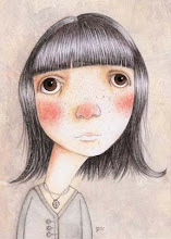
I decided last fall that I should have an illustrated blog header. I've done dozens of sketches since October but I wasn't satisfied with any of them. And then I did this painting last week for a different project and I think it will work. That's one thing I can check off my enormous to-do list.
Saturday, March 28, 2009
Subscribe to:
Post Comments (Atom)


2 comments:
This banner works very well I'd say. Now are all the upturned faces representing the visitors to your blog...? I'd have to say I'm most like the guy on the left... or was 20 years back :) Love the freckles on the centre one... always think they add real character and distinction to a face. Nice text treatment too!
Thanks Matt! I love freckles too - I wish my own were more plentiful :)
Post a Comment