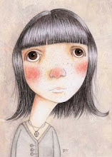
Usually when I'm illustrating an article, I read the article and then come up with ideas on how best to illustrate it. With this assignment, the art director already knew what she wanted for the illustration. My task was to draw a teen girl sitting with her chin in her hand, staring off into space with a dreamy expression like she was in love.
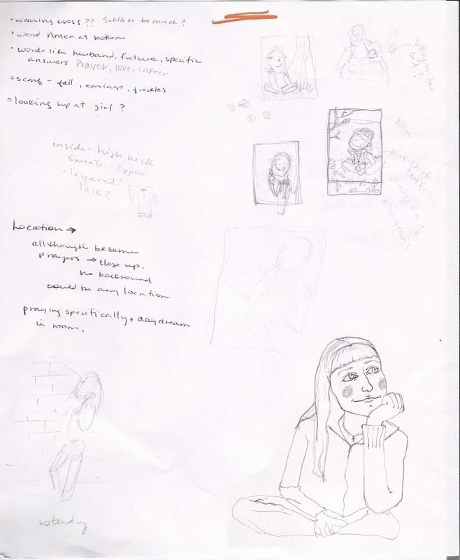
I read the article and made some notes and thumbnail sketches about thing to include, colours that came to mind, possible positions for the girl, angles, settings, etc.
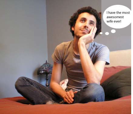
Once I had an idea of what I wanted to do, I got my husband to pose and I took some reference shots. Then I did several sketches, most of which I was unhappy with, but one of which I liked. I was especially happy with the way her expression turned out.
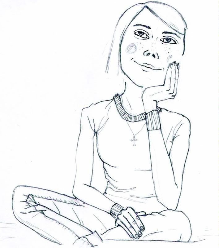
I then scanned my sketch, played with how it was cropped, and placed it in a couple of different settings. I chose 4 different versions to send to the art director.
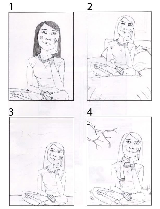
She liked my sketches and chose #4, but requested a few changes. The main thing was that the girl needed to look younger and she needed to be less thin. Since this illustration is for a magazine aimed at teen girls, I absolutely agree with the art director. I just really like drawing skinny arms on people so it didn't even cross my mind.
I made all the changes that she requested and sent her a new sketch.
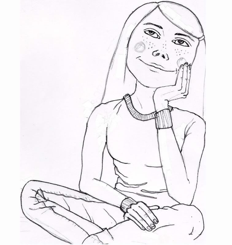
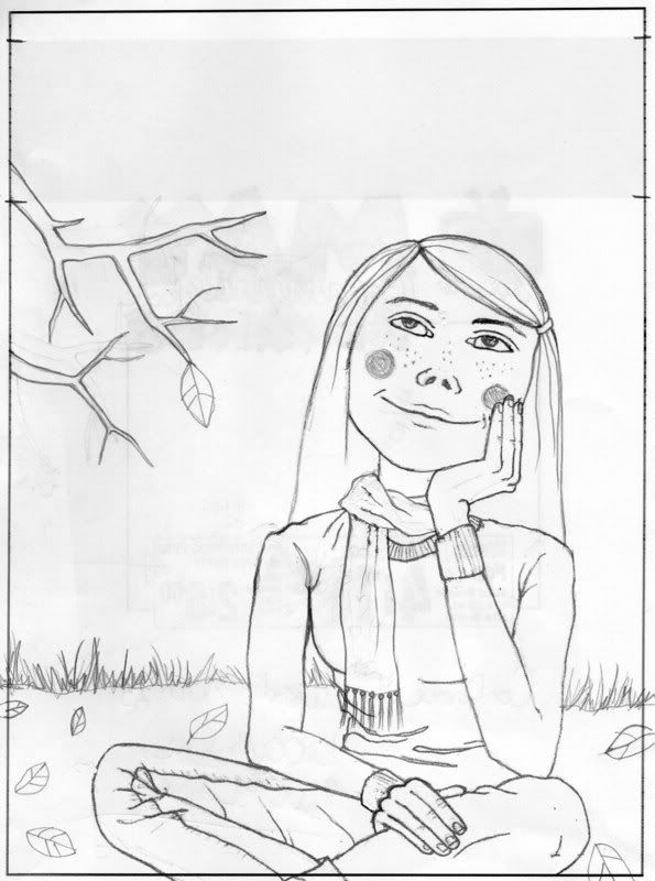
The art director loved the final sketch. She just asked me to raise the branch a bit higher on the page then I could go ahead and paint the final.
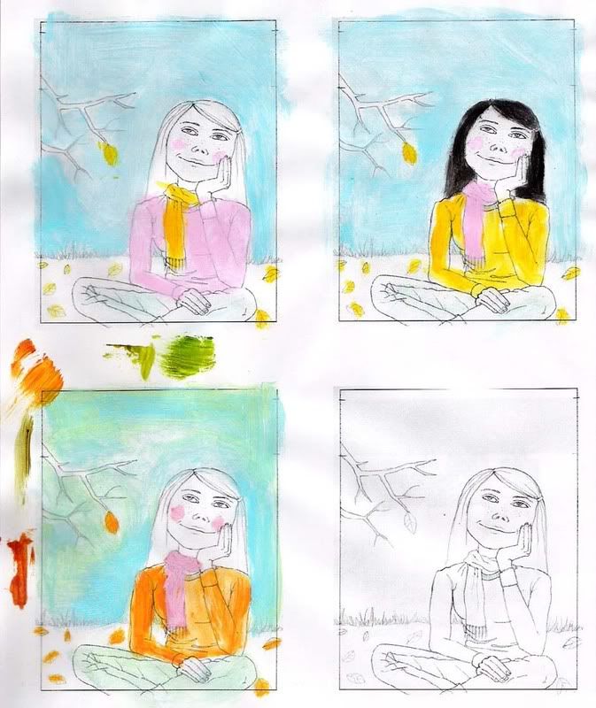
I knew I wanted to keep the colour scheme simple and vibrant. I also had a pretty good idea of what colours I wanted to use, so I tried some variations.
I'll post the final tomorrow.


