© 2007
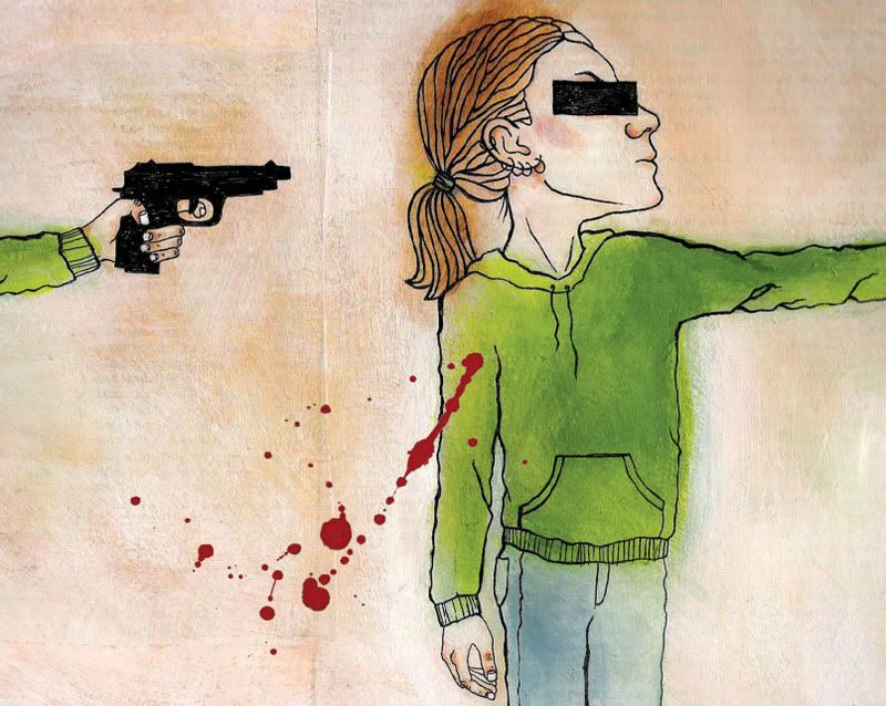
This is my second attempt at this illustration. I used bright orange in the first version I did. The actual painting looked really cool but the scan was awful. I know better than to use that color in something that needs to be scanned and printed, but I loved how it looked in my little color comp so I used it anyway. Bad decision. I had to redo it. Here it is. I'm not sure how I feel about the final. I like the concept, but I'm not sure about this particular execution. I'll probably paint it once more, but not right away. I've been looking at this image for too long.


4 comments:
Hey Jackie,
This one seems farmiliar to me. Is this a redeux of an old project? (PS, that's me being sorta French....but not really at all) Looks good, as always. Although I would've giggled a bit if you had her holdin' the gun all gangsta like. You know, on the side-like, poppin' caps and all. Word.
Yes Colin it is an old project. It's cool that you remember it. I had liked the concept, but I couldn't use that particular version in my portfolio anymore because my drawing style has changed too much since then. I've wanted to redo it for years to use as a promo piece but now that it's finished I'm still not happy with it. I actually prefer the original one from years ago.
And I actually did think about her holding the gun "gangsta like" but i thought it might be unclear. This way there's no mistake that she's holding a gun.
Love the energy. I want to see more background... something that illuminates the concept. Still a great drawring.
later skater
aa
I totally agree. I think it's the background that's bugging me too. I'm thinking that when I redo it, I'll try a red background... and I think I'll change the orientation from landscape to portrait.
Thanks for the feedback.
Post a Comment