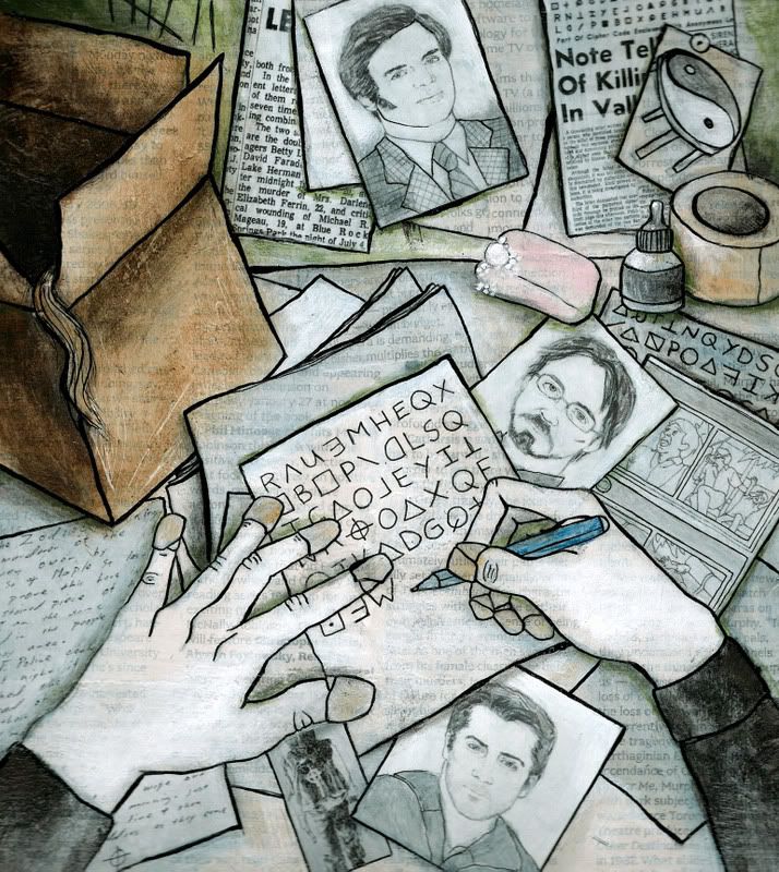
Here's my illustration for this Friday's edition of Swerve Magazine.
© 2007
Monday, February 26, 2007
Sunday, February 25, 2007
Portraits for Zodiac
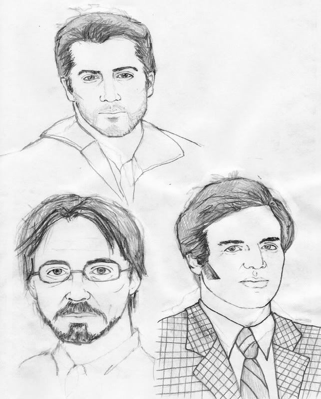
These are some sketches I did of the main actors in the film Zodiac. The one on the top is Jake Gyllenhaal, bottom left is Robert Downey Jr. and bottom right is Mark Ruffalo. I tried to draw them the way they look in the movie. I haven't done a lot of portraits so this was a good experience for me. I like how Mark Ruffalo turned out the best.
These sketches were part of an illustration I'm working on for Swerve Magazine based on the movie Zodiac and its director, David Fincher. I'll post the final tomorrow.
© 2007
These sketches were part of an illustration I'm working on for Swerve Magazine based on the movie Zodiac and its director, David Fincher. I'll post the final tomorrow.
© 2007
Monday, February 19, 2007
Typewriter Sketch
© 2007
This is a sketch for a cover I'm doing for Active Voice. Conceptually, they wanted something a bit abstract. This illo is about written comunication and clarity.
Labels:
Active Voice,
cover,
sketch,
typewriter
Saturday, February 17, 2007
Octopus
© 2007
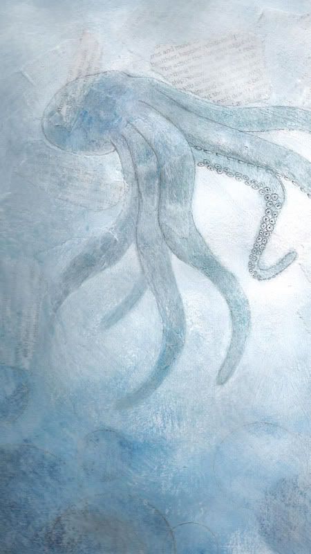
I've been wanting to draw an octopus for a while. Not sure why... I thought I'd try something different for me and not draw on top of my painting with ink. Instead, I used the paint and then a pencil to add just a bit of definition and detail.
Thursday, February 8, 2007
Update
It had been just over 2 months since the last time that I updated my website, but I can now cross that off my to-do list. My updated website even includes a link to this blog. Big thank you to Dario for showing me how to do that and then tinkering with it until it worked. I'm currently working on my next promo and I hope to have those in the mail early next week.
Wednesday, February 7, 2007
Homegirl
© 2007
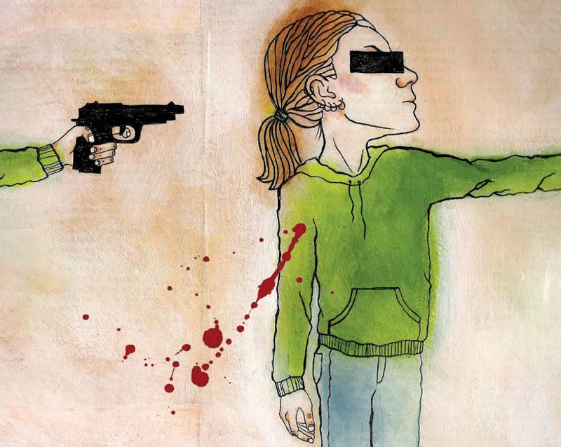
This is my second attempt at this illustration. I used bright orange in the first version I did. The actual painting looked really cool but the scan was awful. I know better than to use that color in something that needs to be scanned and printed, but I loved how it looked in my little color comp so I used it anyway. Bad decision. I had to redo it. Here it is. I'm not sure how I feel about the final. I like the concept, but I'm not sure about this particular execution. I'll probably paint it once more, but not right away. I've been looking at this image for too long.
Subscribe to:
Posts (Atom)