Thursday, June 23, 2011
Tuesday, June 21, 2011
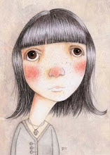
sketchbook - coffee snob
Labels:
character,
coffee,
graphite,
macchiato,
plaid shirt,
sketch,
sketchbook
Sunday, June 19, 2011
hand drawn map
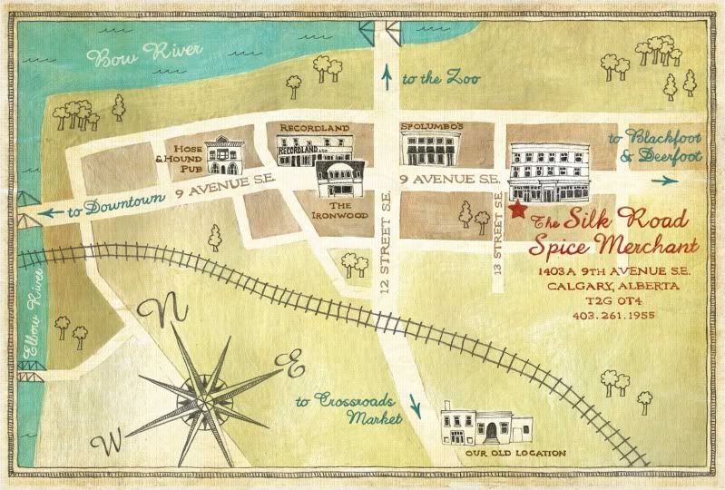
(click on the map to see it larger)
I love the look of hand drawn maps and have been wanting to try my hand at one for a while. I just completed this map for a local business, The Silk Road Spice Merchant, for a postcard they're printing to show their new location. They'll be moving a few blocks North of their current location onto 9th Avenue in Inglewood. That location will be opening the first week of July.
The map highlights some of the landmark buildings and businesses on 9th Avenue as well as shows where the new location is in relation to the old one. Because their business has an old world feel, I tried to do the same thing with the map. I'm eager to see how the finished printed piece will look.
The Silk Road Spice Merchant is a really great shop with lots of delicious spices and blends and anyone who likes to cook should check it out. And if you don't live in Calgary, they have a great website with beautiful photos and tons of great info, AND they ship across Canada.
Labels:
hand drawn map,
map,
The Silk Road Spice Merchant
Monday, June 13, 2011
Saturday, June 11, 2011
portrait of claudia
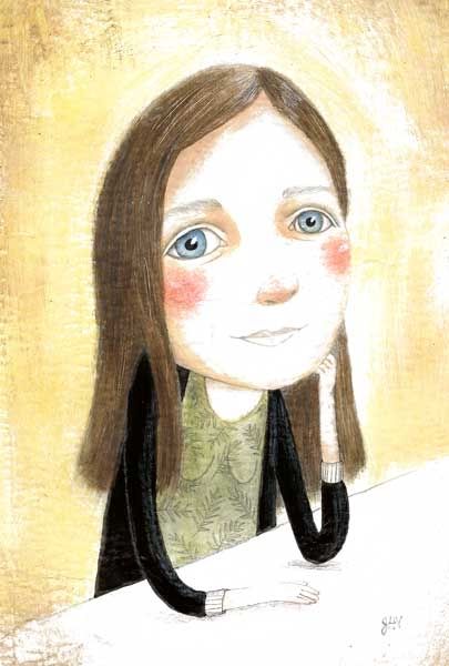
This is a portrait I did this past week as a thank you gift for our friend, Claudia. It's quite a bit more realistic than I like to work, but I had more trouble than usual getting a likeness. The more I reworked my sketch to get it to look like her, the more realistic it got. Hopefully she likes it.
I got a new scanner a few months ago and although I was initially quite happy with it, recently I've been finding that it doesn't pick up a lot of the more subtle nuances, colors and textures, especially stuff that I do in colored pencil, and the whites tend to look blown out. Does anyone have suggestions on how to deal with that? I've messed around with the settings but it doesn't seem to make a difference. Maybe that's the way it's always been and I just never noticed until now.
On an entirely different subject, a girl I know, Kimberly Wieting, makes really funky, strapless, cowgirl dresses from men's shirts. She's submitted her design to a local competition and is currently in 2nd place. If you like her design, I know she'd really appreciate the votes. It literally only takes about 5 seconds and you don't even have to register. You can vote once per day. Just click on this link.
Labels:
Claudia,
Kimberly Wieting,
painted final,
portrait
Sunday, June 5, 2011
Saturday, June 4, 2011
Subscribe to:
Comments (Atom)


